The Creation of the Legends of Localization Logo
Two and a half years ago when Mato, Tony, and I were working on our first book, Tony went through a long process to create a professional logo for us. Tony’s the designer of all the LoL books, and he also loooovvvves fonts and typefaces. Thanks to his hard work, we have a pretty iconic logo:
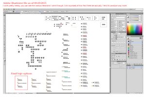
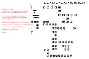
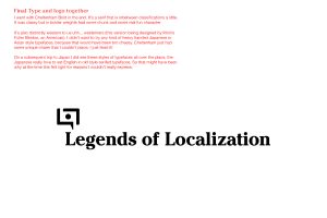
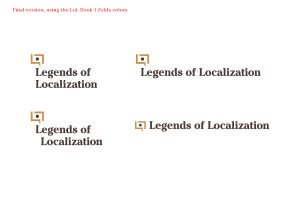
But how did Tony reach that final design? Scroll through these annotated screenshots for an inside look!

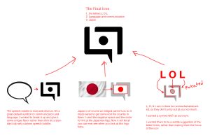

I thought that the logo was meant to be the letters broken up/rotated, I thought that was kinda cool.
I feel like a pixel logo could still be useful for certain projects where appropriate, they did look nice.
Oh, I never noticed the Japanese flag or the “LOL” in the logo. I always just viewed it as a stylized speech bubble. Interesting.