The Evolution of a Thumbnail
The latest project on LoL is Final Fantasy VI: Five Script Blitz, a video/article series where Mato compares five FF6 scripts all at once. We needed a name and logo for ~branding~, so I set to work.
At first, it was called “Five Script Mix”. I’m still learning the basics of design, so here’s the first process:
Mato wasn’t a fan of the gradient, and we also tweaked the name a bit, so this was the next one:
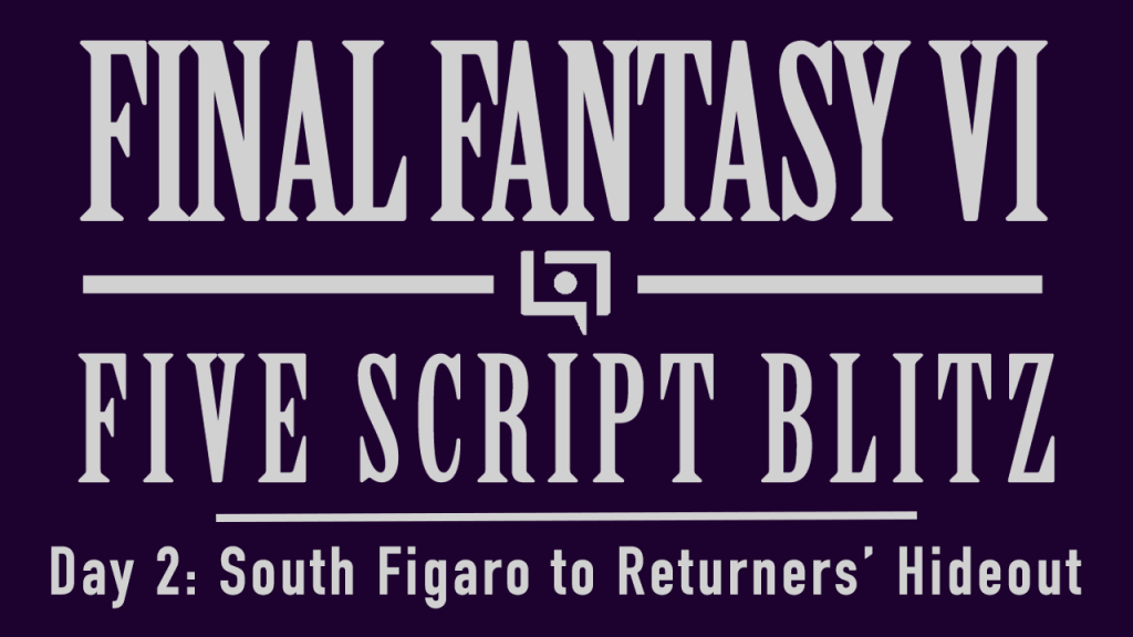
Perfect! Forever done. It’s the template we’ll use for all of them. Here’s day 2:
Buuuuut, wow Day 2 looks way too same-y when compared to Day 1. We gotta make a change. I tried to incorporate a screenshot that would best sum up each day, and it was messy at first:
Looking better, but the text on the bottom felt too busy and out of place. So I did another tweak:
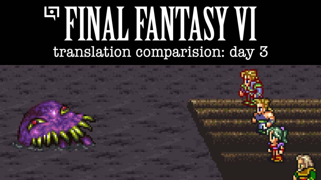
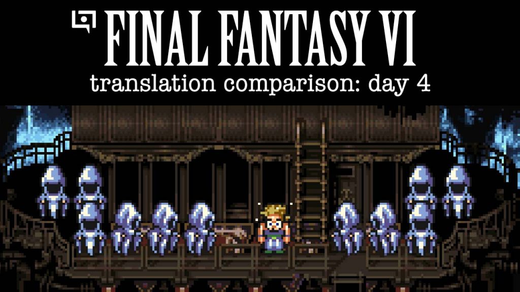
Yeah!!! We got it!! … except …. There’s a typo in “comparison”. Well, gotta fix that:
Yessss, now we finally got it! This is the style we’ll use for the rest of the project.
Nice work! I’m really enjoying the series so far, just wish it was at a better time in my timezone 🙁 But I’ve been keeping up with the archives.
I am glad that I decided to play through before watching you guys (currently I’m at the floating continent). I think it just makes it easier to follow along with the other scripts without having to pay as much attention to the general plot since I’ve already gone through it recently. Plus I think it’s actually got a plot that I enjoy experiencing as it goes rather than having it all spoiled already (though I do know some of the plot points along the way).
Great job on the design! I just love the font. I can’t explain it, but there’s something incredibly pleasing about it.